Uninstalled! How to avoid this fate for your App

A study conducted by Google just over three years ago found that the more usable an App is, the higher engagement will be and the less chance there will be of an uninstall.
Sounds obvious, yet, how many Apps have you uninstalled in the last year? Clearly not everyone gets this right on their App Development journey. So what do the principles of UX say about good App Development? And How can Auckland app developers ensure they create highly usable and intuitive apps that deliver consistent user engagement?
Below we cover some key questions to ask in order to develop Effective Mobile Apps; but first an opening quote that highlights one of the most important principles behind UX.
“Simple design is easily missed, but really effective, if implemented right. “ – Himanshu Khanna
SEVEN QUESTIONS TO ASK YOURSELF IN ORDER TO ENSURE YOUR APP DEVELOPMENT PROJECT IS SUCCESSFUL FROM A UX PERSPECTIVE.
1. WHAT ARE YOUR USER’S GOALS?
When you open an App on your device you generally have a goal in mind. You are almost always hoping to get something done. Whether it is in your personal life or an App related to your workplace you have gone there for a purpose. When designing your Mobile App Development project ensure you spend plenty of time with the potential users to understand their needs and the environment in which they’ll be using your app.
A common approach to documenting the core outputs of this is writing User Stories; which are actually just a set of simple sentences in the format of, “As a {role} I need to be able to {do/achieve something} so that {reason}”. E.g. “As a manager I need to be able to see my team’s performance stats so that I know who needs extra coaching”. One of these lines can be created for each role-objective combination.
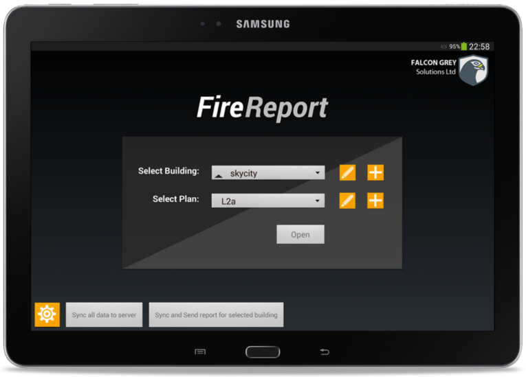
Throughout this article we’ll be referencing two real-world examples of workplace apps to illustrate key points. Below is the first screen of an app we built for the Passive Fire industry, reflecting the user story of, “As a Passive Fire Specialist I need to be able to find and open plans for buildings I’m working on (as easily as possible) so that I can get straight onto adding the data”.
2. WHAT IS YOUR “ CALL TO ACTION” ?
The importance of a clear CTA (call to action) is highlighted most often in terms of web pages, but it can also be applied to the key action on any given screen within an app or other software.
Think about it in terms of what the natural working flow is for the user; the most obvious CTA should reflect this whilst other controls are visually deprioritised.
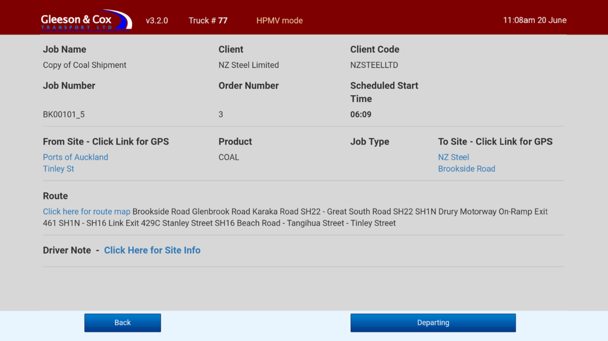
The somewhat bland screen shown below is the job screen of an app for truck drivers, replacing the crackly RT. There’s a lot of information on-screen but, in terms of what they need to do, most screens in this app have a large blue button at bottom-right that’s all the driver needs to press. This one says, “Departing”, but in essence it’s a process of Next, Next, Next through a guided workflow.
3. HAVE YOU THOUGHT ABOUT THE SIZE OF A HUMAN THUMB?
People interact with their devices with their fingers and often even a thumb. It is important to make your interface elements big enough for them to easily touch the right control. Research shows that people use their thumbs more often than any other finger when using their smartphone. So even on a screen with lots of information, ensure your controls are big enough for even the biggest hands.
As an example, the screen below only has six things on it to touch, all of which are bigger and/or more spaced out than the other content.
4. HOW MUCH CONTROL DO YOUR USES HAVE?
There are two fundamentally different approaches that can be taken to app design. The one above is based on the concept of a Guided Workflow, which is useful in a very process driven environment where you don’t want to give users much autonomy. Nevertheless, for higher level tasks most people do prefer to control their own journey; to feel a degree of autonomy around how they approach their work. So the contrasting idea is what we’d call a Freeform app, which presents a range of controls that allows users to take many paths depending on their needs at the time.
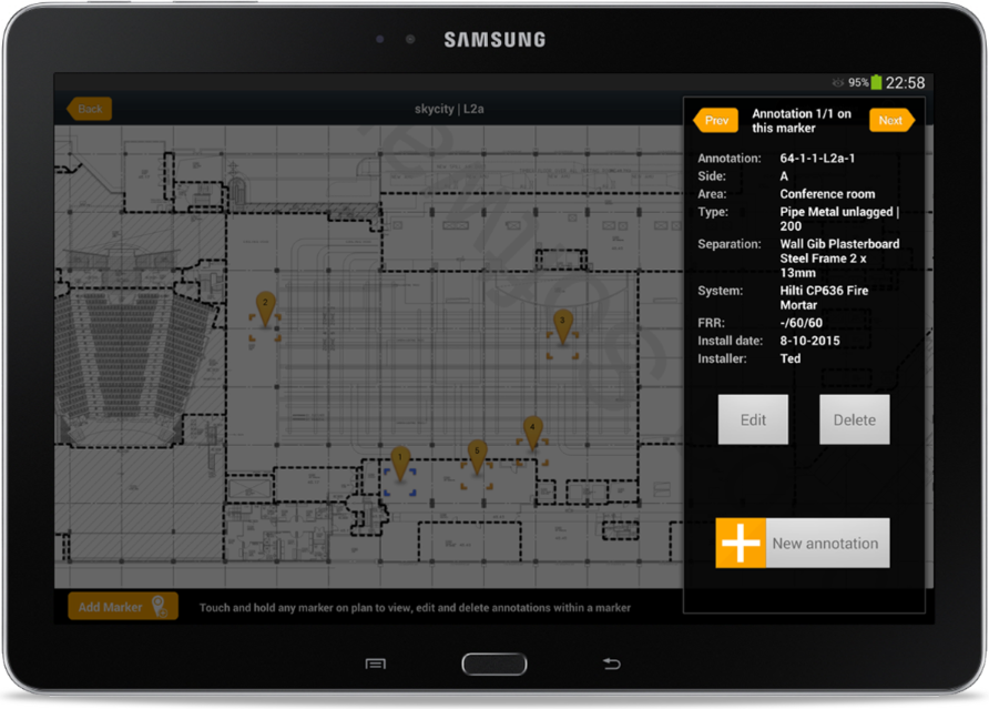
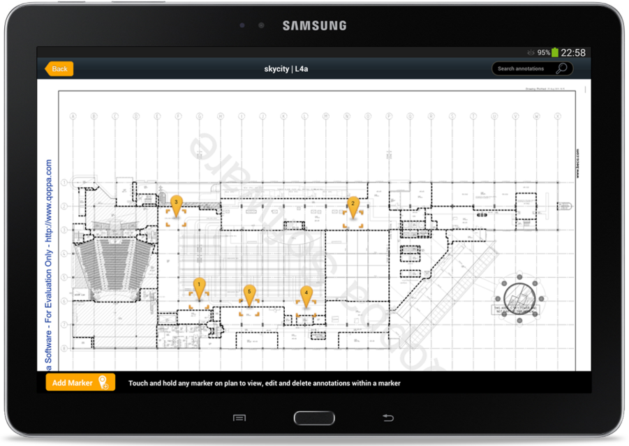
For instance, in the screen below the user can cycle through passive fire information using the Prev, Next buttons, edit, delete or add, jump to another marker on the plan, add another marker to the plan or exit the plan.
The key question around which sort of approach to use is to ask what kind of user the app is intended for. Someone who may have little interest or experience with tech, or someone used to working with software in office environments and so forth.
5. HOW CAN YOU MINIMIZE DATA INPUT?
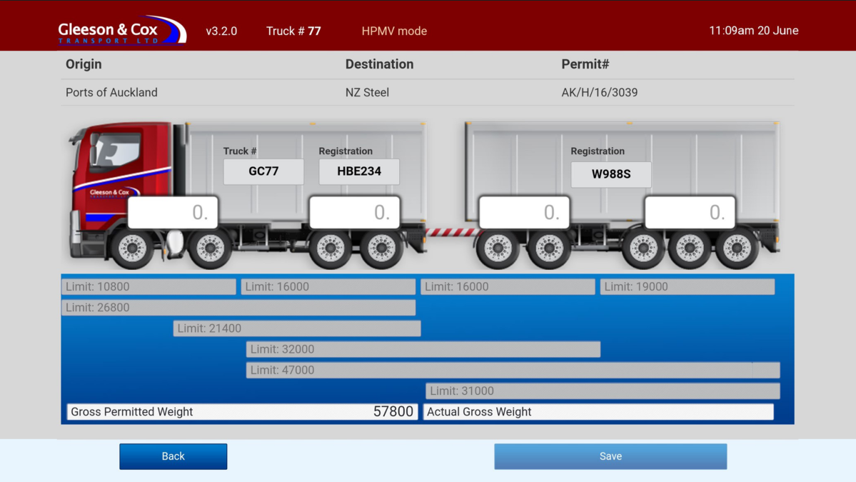
This question is crucial to ask yourself when developing your App. A mobile device’s text input can be cumbersome and frustrating. How often have you deleted an App precisely because of this. Especially when designing an App that solves a critical problem for a workplace, you don’t want users to just not bother following through on actions or making mistakes because it feels too hard or confusing.
In the screen below we presented back to the user all the data the app already knew about, then asked only for the additional data that was essential (the four input boxes). We also sought to make the data meaningful by showing it over a schematic of their actual truck, indicating that it’s the weight on each axel set as they roll it onto the weigh-bridge that they’re entering.
6. HOW CAN I ENSURE THAT USERS HAVE A ‘’SEAMLESS EXPERIENCE’’?
The thing is with a seamless experience is that if done right it’s an invisible factor. The user doesn’t realise that the flow of the App has been thoughtfully created and they just feel ‘right’ using it. Seamless aspects can include:
Not being blocked; if extra information is required in a process, try and obtain it dynamically rather than blocking the workflow
Maintaining a clear sense for the user of where they are in the app and how to get back or go where they need to
Enabling a workflow that matches the way users work in the real world
Where possible handling loss of connection seamlessly
With regards to the last of those, both the apps we’re using as examples here are designed to continue working when offline. In the case of the Driver app, it just gets and sends info when it is in cellular data range and this has always proven sufficient to keep up with the user’s needs. The Fire Report app on the other hand requires connection to download plans or upload the information recorded, but the information recording process can be done even when offline.
7. HAVE YOU CARRIED OUT THOROUGH USER TESTING?
The two best times for this are during the prototyping phase, where testing with real users usually reveals needs for design changes (before time has been wasted building the actual product to the wrong specs), and at the earliest point that you can release a Minimum Viable Product (MVP) for real world trials. The third best, if you were gung-ho and skipped the first two building your product, is right now.
We build an app for use in medical centres that for years we thought was a perfect fit for users needs, until we actually got in the car and went and observed people using it in the centres. While overall the app was fit for purpose, we suddenly saw blockers and needs that we could never have guessed from the comfort of our office. Testament that sometimes as app developers we need to get off our butts and spend time at the coal face.